


Opera is the name that was given to Hot Pink by the art world. You will find that different brands name their Opera slightly differently. Winsor & Newton calls theirs Opera Rose, Daniel Smith calls it Opera Pink, and Holbein, Quinacridone Opera. They all share the main pigment base of PR122, which is Magenta, with a bit of fluorescent dye called Rhodamine B to really make it sing. Ha.
After doing some brief research, I have come up with a few theories on why opera is named so. Magenta is its primary base, which is a beautiful bright pink, and Magenta was named after the city in Italy it originated from. The art of opera also originated from Italy in the 17th century, so perhaps someone connected the dots there to give it a catchy name that could be easily remembered. Or perhaps the neon vibrancy of the color matches the frequency of high notes sung in operatic style?
The problem with this color is that it is not lightfast because of the fluorescent dye. Sadly, it fades over time with sun exposure, which makes opera a “fugitive” color. I did a swatch test with the four opera colors I own. Opera Rose by Winsor & Newton, Opera Pink by Daniel Smith, Quinacridone Opera by Holbein, and Rose by Holbein (this one is a gouache, an opaque watercolor). I made two identical swatch sheets back in April but left one hanging up on a window that doesn’t get direct sun. Nine months later, this is what happened. The colors that were exposed to the sun lost their blue-ness, resulting in a color that looks more like magenta, but is still more “hot pink” than just straight up PR122. I saw a review online that Holbein’s Quin Opera was permanent and was skeptical but I purchased it to try, and was right to be skeptical. It’s just not possible.


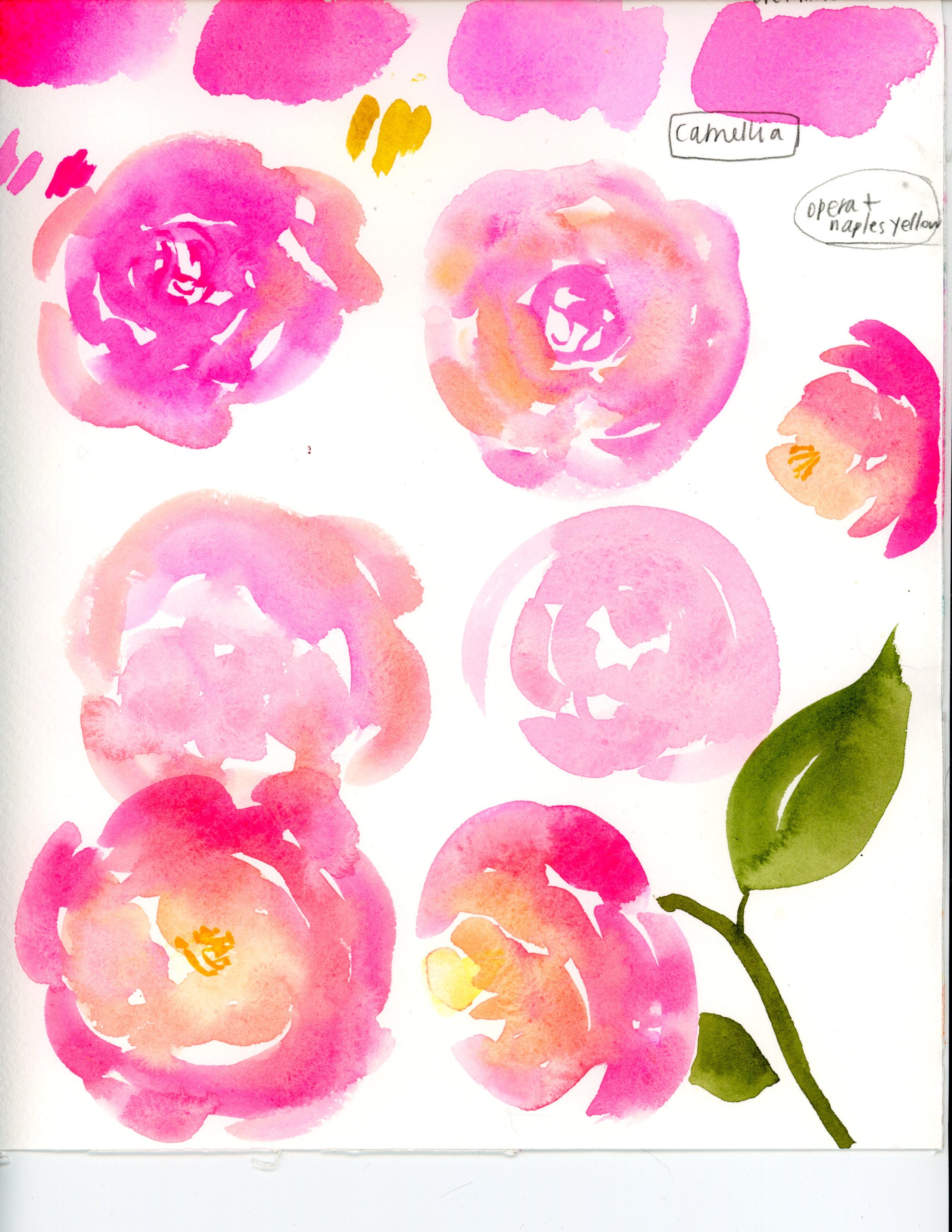
There are two types of people in the watercolor world— people that embrace opera and use it liberally, fading be damned, and people who never use it because of its transient nature. I have been both types, but if you attended my class in the last year or so, you’ll know that I use it as a primary color when given the choice of only three colors. My main go-to three-color palette is opera, Naples yellow, and cobalt turquoise. They provide my favorite color mixes of all time! Super bright, saturated colors but also more muted tones from the opacity of turquoise and white (PW6) in Naples yellow.

Next post I will be coming at you with some examples of hot pink used in media, and how I feel about those guys!
Happy holidays :)
Nicole
The swirly swatches reminds me of a Spiriling Out post by Austin Kleon https://austinkleon.com/2022/02/24/intentionally-spiraling-out/
Terrific colors, ty for sharing.